AI applications - Appeconomy Insights
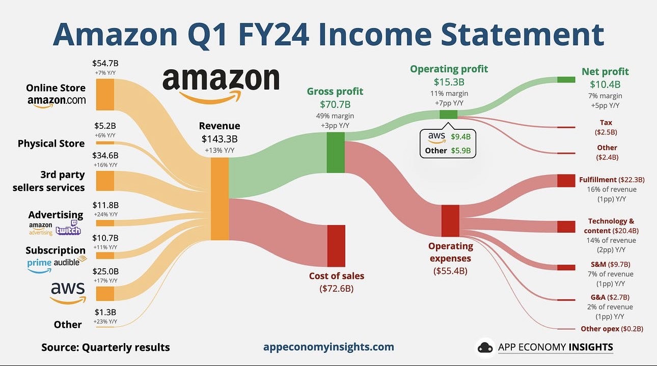
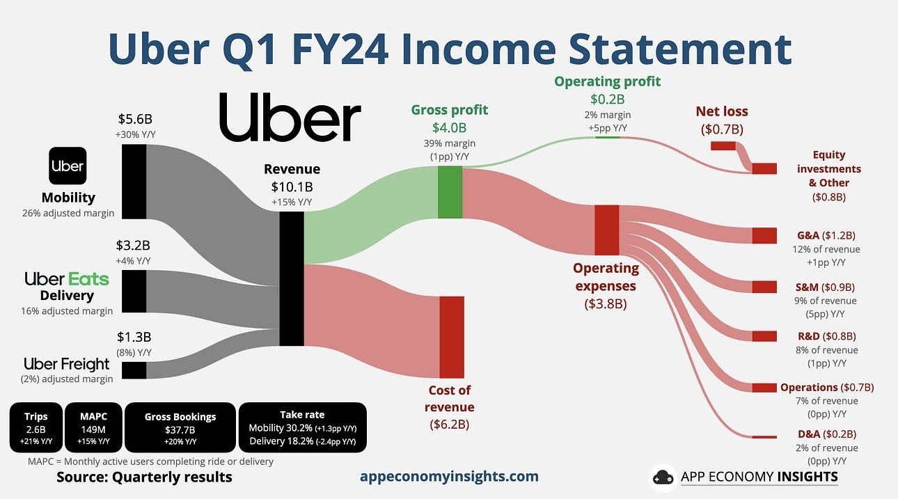
I came across the below charts produced by Appeconomy Insights on the feed of someone I follow on X. I think it provides a really good visual cheat sheet for quickly assessing a company (NVIDIA looks great, Amazon Ok, wouldn't touch Uber with a barge pole). With the meeting recently discussing using AI I wonder if feeding the images into an AI and requesting it generate them for ASX companies would work. Hope the group finds this interesting.


14