Why I Wish He Wouldn't
I couldn't help myself write this straw on why I wish David Williams would change his investor relations behaviour. The commentators I have seen since yesterday's trading update announcement have made three statements about yesterday's release:
- Why report two months sales data compared to pcp, when the quarter end is a few days away? (There wasn't even an $8m month to at least be consistent with previous patterns of reporting) Particularly when there isn't really anthing to disclose.
- The growth results are strong, fair enough. (Particularly given the languishing SP)
- It doesn't change views on valuation
That's pretty much where I was yesterday in my straw.
But, you say, the market has moved up 14% in the two days. True, but the stock is still down 50% from its current 12m high in February.
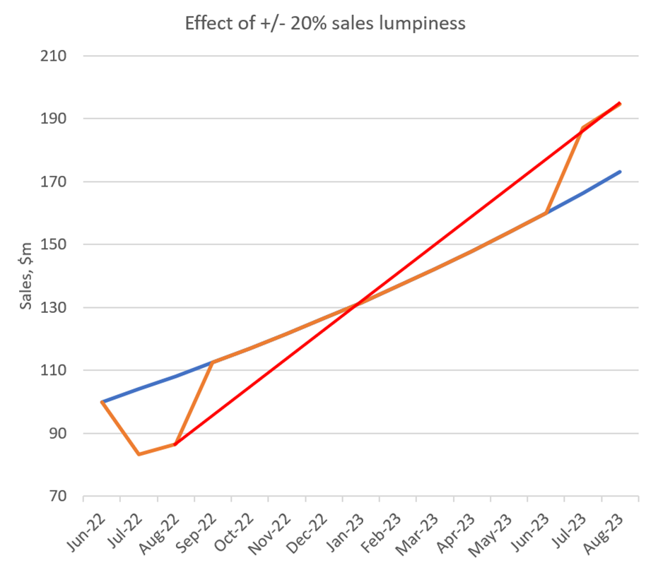
So here is why I don't like David's "cherry picking reporting" and it needs a graph to explain. Note that the numbers below are made up, as they seek to illustrate a general point that is applicable to $PNV. The calculated rates of growth are relevant, however.

So here's what it shows. (Don't worry about the absolute numbers, I just picked 100 as an arbitrary starting point!)
Blue Line (acutally a curve), starting at June-22 at 100, this line grows each month at a compound monthly rate of 3.99% or 60% p.a. - which is in the ballpark of $PNVs current annual sales growth.
Orange line: Jul-22 and Aug-22 are depressed below the trend by 20% - indicative of the lumpiness we know exists month to month in $PNV sales. Let's assume we had two bad months at the beginning and two strong months at the end. The "lost" sales from the beginnining are added back in above trend in Jul-23 and Aug-23. So the total sales over the 14 month period is the same for the Blue curve and the Orange curve. It's just that the blue curve is perfectly smooth and on trend while the orange curve is lumpy at each end.
This is my suspicion of what could be going on. Two soft months cherry-picked at the start and cycling two strong months at the end for pcp comparison.
Red Line: So, let's do the maths. What's the ANNUAL SALES GROWTH rate from Aug-22 to Aug-23 (or Jul-22 to Jul-23)?
Blue Line = 60% growth. Red line (for orange curve) = +125%. Over double the underlying growth rate.
That's how misleading annual growth numbers can be if you cherry pick your data-set.
Which is why the high reported numbers in yesterday's ASX release from a management team with a reputation for cherry-picking data shouldn't necessarily result in any change in our view of the underlying value of the business.
Of course, the good news is that, even if the release represents "peak cherry picking", its does mean that underlying revenue growth is still in the region of 50-70%, whereas the market is expecting +42% this year and +34% in FY25.
As a result, no analyst upgrades should be expected, apart from the bears who have a SP <$1.50 or so. (There is one in my dataset with a price target of $1.08. Maybe they'll wake up one day).
Life would be much easier if we got any of the following:
a) Monthly sales, every month or
b) Quarterly sales, every quarter or
c) HY and FY results. Period.
Of course, I could be wrong, and perhaps the underlying trend is stronger. I hope it is. But that's the problem with management who are too promotional and inconsistent in how they report. You just can't tell.
If I wasn't so high conviction on the product and the business, I think I would have given up long ago due to exhaustion.
No doubt, the David Williams Circus will continue to roll on. So,... roll up, roll up.
Disc: Held
